Trust Badges & Icons for Shopify Store - GoodySell App
A complete guide to setting up Trust Badges & Icons on Shopify - from enabling the app and creating your first badge to choosing widget types, customizing styles, translating content, and targeting specific products or collections.
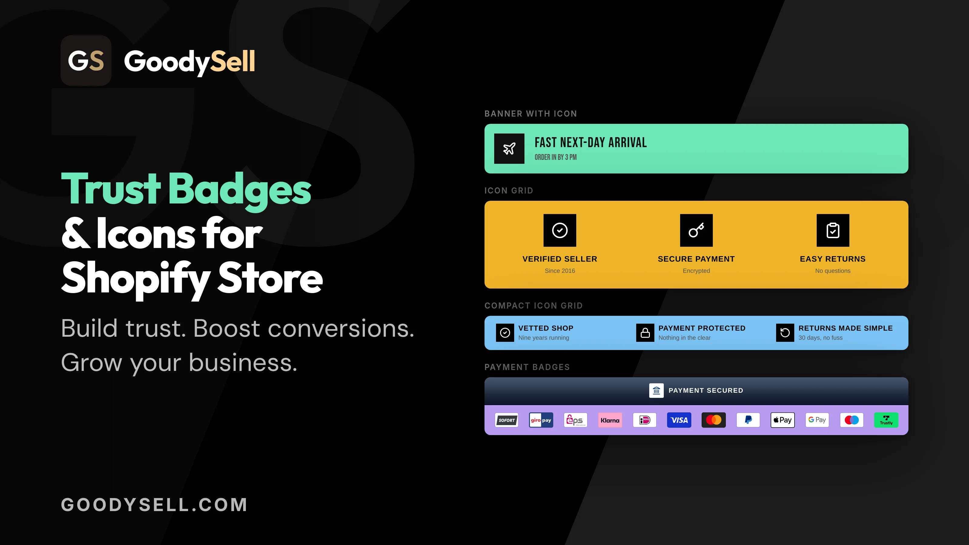
Everything you need to add trust badges to your Shopify store - from your first badge to fine-tuning each widget type, placing it exactly where shoppers will see it, and understanding why trust signals matter.
In this article, we'll explore how to add trust badges and trust icons to your Shopify store using the GoodySell Trust Badges & Icons app. You'll learn how to create your first trust badge, choose the right widget type, customize its design, and place Shopify trust badges in the right location to build customer trust and create a more confident shopping experience.
Why trust badges matter
Online shoppers can't hold your product, walk into your store, or read a stranger's body language at the counter. Trust badges give them the reassurance they'd get in person — clear, visual signals that your store is safe, your checkout is secure, and their purchase is protected.
Placed near the add-to-cart button or on the cart page, they answer the quiet questions every shopper asks before buying:
Is my payment secure?
Security seals and SSL messaging reassure shoppers their details are safe.
Can I pay how I want?
Payment method icons confirm you accept the cards and wallets they use.
What if it goes wrong?
Money-back and easy-returns messaging lowers the perceived risk of buying.
Is shipping worth it?
Free-shipping and delivery badges set expectations before the shopper hesitates.
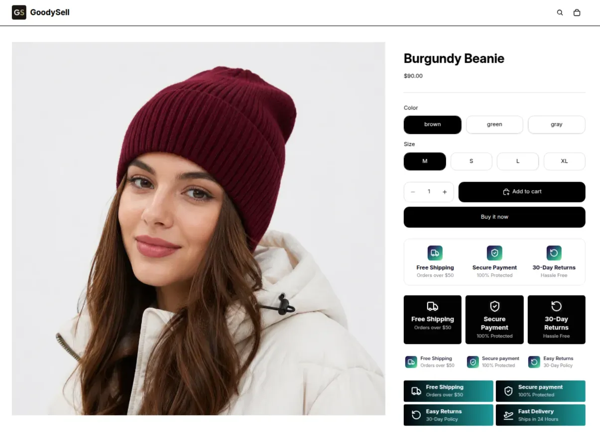 The photo shows how badges can be placed on a product card. Their appearance can be customized to suit your needs, with a very wide range of configuration options.
Trust Badges & Icons lets you place these signals anywhere on your storefront, match them to your brand, and control exactly which shoppers see them — all without touching your theme's code.
Getting started & enabling the widget
After installing the app, there are two quick things to set up before your badges appear on your storefront: turning on the app embed, and adding the badge block where you want it to show.
Turn on the app embed
The app embed is the master switch that lets your badges render on your live theme. From the app's home page, the setup banner walks you through it.
Open the setup banner
On the app Home page, find the setup banner at the top and click the button Enable app embed to open your theme editor.
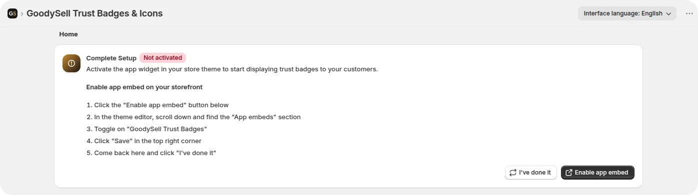
Enable the embed
In the theme editor, scroll to the App embeds section and toggle on GoodySell Trust Badges & Icons.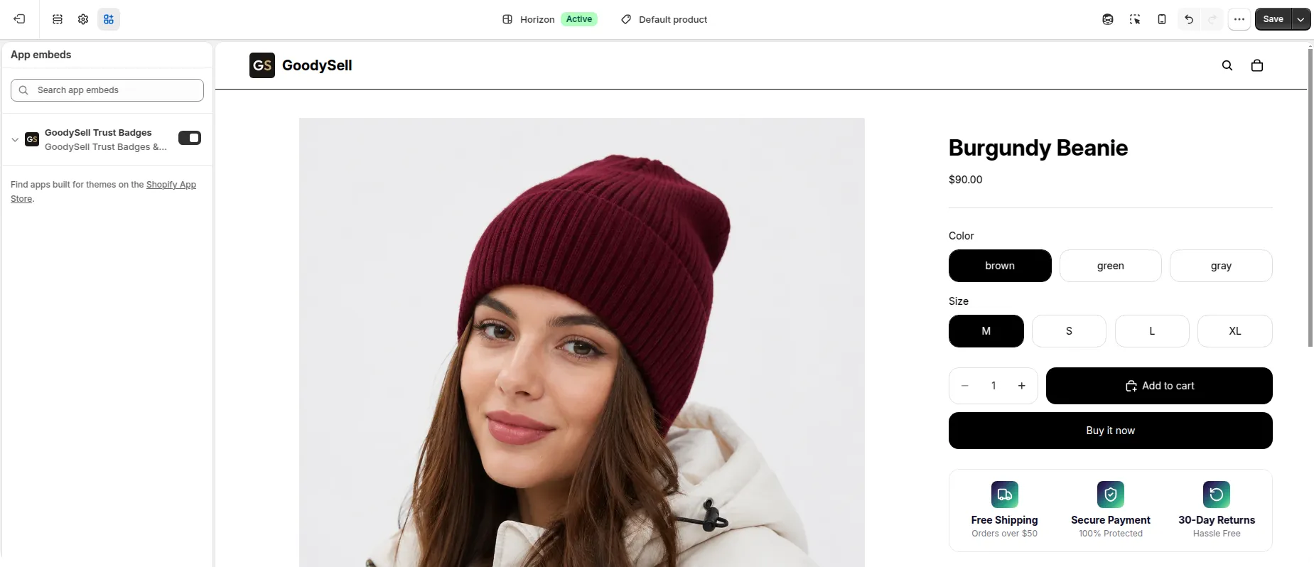
Save
Click Save in the top-right corner, then return to the app and confirm you've done it.
Good to know
Each badge you create shows a live status banner in its editor — telling you whether it's placed and rendering on your storefront, or still needs to be added to your theme.
Creating Your First Badge
Click "Create New Badge." From the Home page, in the All Badges section, click + Create New Badge.
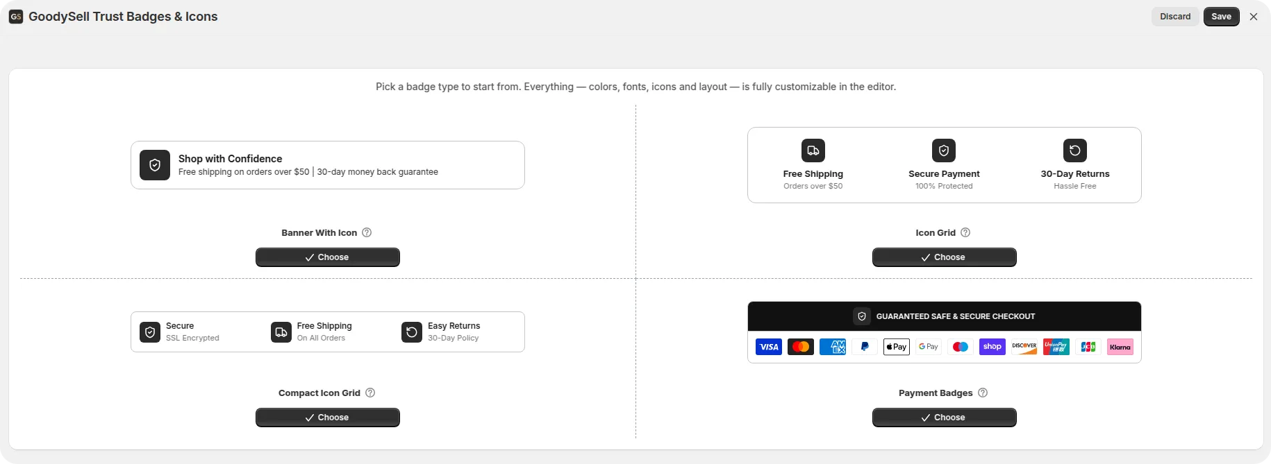
Choose a badge type. You'll see the four widget types, each with a live preview. Pick one and click Choose — everything, including colors, fonts, icons and layout, stays fully customizable in the editor. Changed your mind later? Change badge type in the preview panel takes you back.
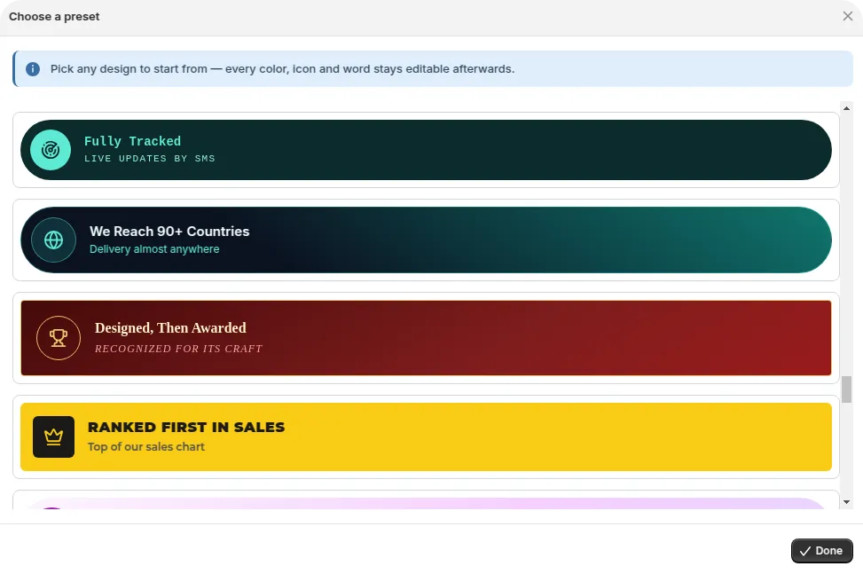
Start from a ready-made design (optional). In the preview panel, click Browse presets to open a library of 120 ready-made designs. Pick any of them as a starting point - every color, icon and word stays editable afterwards.vWork through the editor. The left sidebar groups the settings into Badge (name and visibility), Content (icon, text, CTA), Style (layout & appearance, icon style, typography) and Settings (where it shows, who sees it). The live preview on the right updates as you go — switch between Desktop and Mobile to check both.
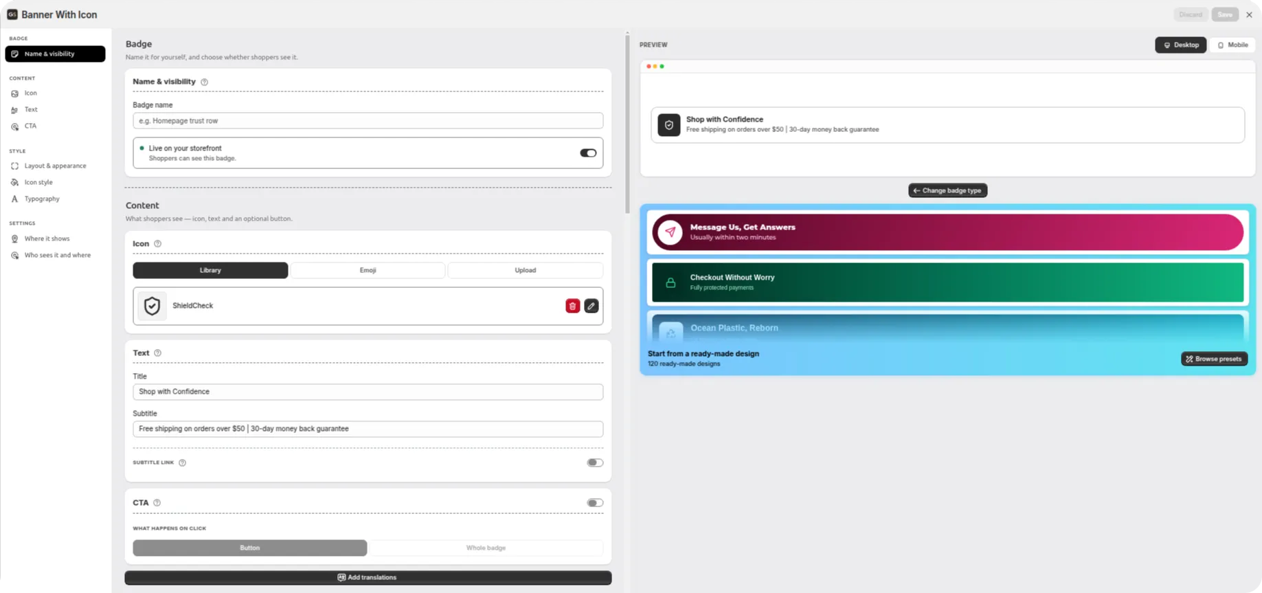
Set visibility and save. Give the badge a name for your own reference, then use the Live on your storefront toggle to decide whether shoppers can see it — off keeps it as a draft. Click Save in the top-right corner.
Tip
The four tabs are organized to make customization easy:
Badge — configure the badge type and its main settings.
Content — add and edit your text, icons, and other content.
Style — customize colors, typography, spacing, borders, and other visual elements.
Settings — manage additional display and badge settings.
If you’re not sure what a particular option does, hover over the ? icon next to it for a simple explanation.
The four widget types
Each type solves a different job. Here's how to choose — the sections that follow go deeper on setting up each one.
Banner With Icon
A single banner with one icon, a title and a description. Best for highlighting one key trust message — like a guarantee or a shipping promise.
Icon Grid
Several trust badges shown in a row or grid, each with an icon and label. Great for showing multiple signals at once — secure, shipping, returns.
Compact Icon Grid
A tighter, space-saving grid of icons with short labels. Ideal when you want several signals in a clean, minimal strip.
Payment Badges
Display the payment methods you accept with recognizable icons. Reassures shoppers at the moment they're deciding to check out.
Setting up a Banner with Icon
The banner is your simplest, most focused badge: one icon, a title, and a supporting line. Use it to make a single promise land clearly — "Shop with Confidence", "Free Shipping on All Orders", "30-Day Money-Back Guarantee".
Content
The Content group covers three blocks:
Icon — choose from the built-in Library, use an Emoji, or Upload your own. Uploads come in two flavours: an Image file, or SVG code pasted straight in.
Text — the Title is the main line, the Subtitle the supporting line beneath it.
CTA — off by default. Switch it on to decide what happens on click: a Button with its own label, or making the Whole badge clickable. Then point it at a Product, a Collection, or any URL.
Styling the icon and banner
Under Style, the Icon style section controls the icon's size, color, background and border radius, with an Advanced panel for finer spacing. Because a custom image is styled the same way as a built-in icon, you round its corners with the icon's Border radius.
Layout & appearance handles the banner itself: Full width or Custom width (with a max width in pixels and left/center/right alignment), the font, and the background. Open Advanced for the border (color, style, width, radius) and spacing (margin, padding, gap — each with a Same for all shortcut).
Tip When the CTA is set to Button, a Button style section appears in the sidebar, so the button gets its own colors and typography rather than inheriting the badge's.
Setting up Icon Grid & Compact Icons Grid
Both grids show several trust signals side by side. The difference is density: Icon Grid gives each item more room; Compact Icon Grid packs them into a tighter, minimal strip. Setup is nearly identical.
Building your items
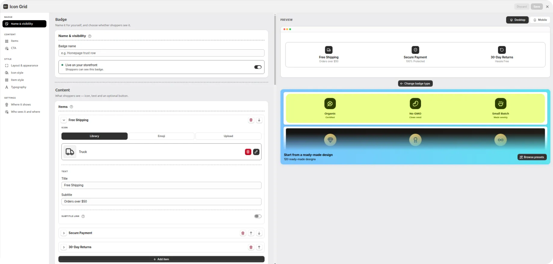
Under Content, each grid item has its own icon, title and subtitle. Add as many items as you need with Add item, and reorder them freely.
Give each item an icon (Library, Emoji, or your own image/SVG), a title (e.g. "Secure", "Free Shipping", "Easy Returns"), and an optional subtitle (e.g. "SSL Encrypted", "On All Orders", "30-Day Policy").
Use the move controls to reorder items, or remove ones you don't need.
The CTA block asks where the call to action lives: Per item — so each signal links somewhere of its own — or Whole badge.
Grid styling
Under Style, the grid gives you fine control:
Item — the background and border radius of each individual cell, with an Advanced panel for its border and padding. Items are sized to be equal-width so nothing looks lopsided.
Icon style — size, color, background and border radius for the icons themselves.
Layout & appearance — width and alignment, font, background, plus the Gap between items under Advanced.
Typography — title and subtitle handled separately: color, size, weight, style, decoration, casing, letter spacing, and the subtitle's top margin.
Good to know Every style control accepts generous values, so you're free to go bold with large icons, thick borders, or rounded "pill" corners — nothing caps you at a small maximum.
Setting up Payment Badges
Payment Badges show shoppers exactly which payment methods you accept — the cards, wallets and services they already trust. The library holds 800+ payment methods, covering major cards, digital wallets, buy-now-pay-later services, bank transfers and regional methods.
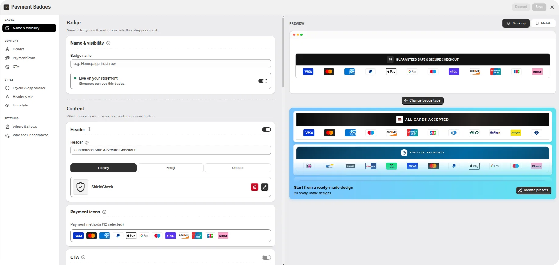
Set the header
The Header block sits at the top of Content and has its own on/off toggle — switch it off if you want a bare row of icons.
Header text — the line above the icons, e.g. "Guaranteed Safe & Secure Checkout".
Header icon — the small icon beside that text. Pick from the Library, use an Emoji, or Upload your own.
Choose your methods
Open the picker. In the Payment icons block, click the row of selected methods to open Select Payment Methods.
Search and add. Type in the search box to filter the 800+ available methods, click the ones you want, then click Add. Selected methods appear as chips at the top of the dialog with an × to remove them.
Select only what you accept. Pick exactly the icons that match your real payment options — showing methods you don't accept only confuses shoppers.
Make the icons clickable
The CTA block decides where the call to action lives: Per item or Whole badge.
With Per item, each selected method expands into its own settings under Payment icons. Turn on Item CTA for a method and choose whether the click target is a Button with its own label or the Entire item clickable, then point it at a Product, a Collection, or a URL. Every method can lead somewhere different — handy when one of them needs its own landing page or explanation.
Styling the header and icons
Under Style you get four sections:
Layout & appearance — the badge's width (full or custom) and font.
Header style — the heading's background, text color, font size, weight and style. Advanced adds text transform (uppercase and friends), letter spacing, the border around the header (color, style, width) and its padding, with a Same for all shortcut.
Icon style — the header icon: size, color, background, border radius, plus border and padding under Advanced.
Button style — colors and typography for per-item CTA buttons, with border radius and padding.
Payment Icons — the size of the payment logos and the gap between them.
Tip Keep the payment row honest and current. With 877 methods available it's tempting to pad the row out, but shoppers scan it in a split second — an accurate short set builds more trust than a long one.
Placement & targeting
Once a badge looks right, decide where it shows and who sees it. Both live under Settings in the sidebar, and they work the same way for all four widget types.
Where the badge appears
Product page — shows on individual product pages. A natural home for trust signals, right by the buy button.
Cart page — shows in the cart. A strong spot to reassure shoppers just before checkout. Pick one of two Cart display options:
Cart page — works on any theme that supports app blocks on the cart page, which is standard on modern Online Store 2.0 themes. If your cart page doesn't support app blocks, the badge won't appear there.
Cart drawer — the slide-out cart. This works with the Dawn and Horizon theme families; on other themes use Cart page instead. Choose whether the badge sits at the Top or Bottom of the drawer. Spacing inside the drawer varies by theme, so if the badge sits too tight against the cart or the checkout button, adjust its margins under Style.
A Hide when cart is empty toggle keeps the badge out of the way while there's nothing in the cart.
Custom position — place the badge anywhere in your theme by pasting a small snippet into a Custom Liquid block. Save the badge first, then copy the snippet. Not all themes include Custom Liquid blocks, and you can paste the same snippet in as many places as you like — the badge renders in every one of them.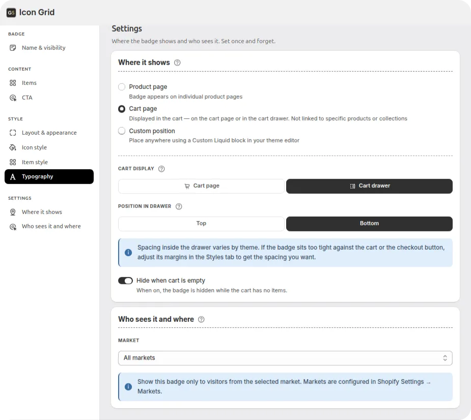
Who sees the badge
Product-page badges can be targeted precisely:
All products — the badge shows store-wide.
Specific collection — only on products in a chosen collection.
Specific product — only on the product you select.
Products with specific tags — on any product carrying the tags you list.
How targeting priority works When more than one badge could apply to a product, the most specific wins: Tag → Product → Collection → Shop. So a tag-targeted badge takes precedence over a store-wide one on the same product. This lets you set a general badge for the whole store and override it for specific products.
Note on cart and custom position Cart-page and custom-position badges aren't tied to individual products, so product targeting doesn't apply to them. Custom-position badges in particular appear wherever you paste the snippet, and can't be limited to specific products, collections or tags.
Show it in one market only
Every badge has a Market setting. Leave it on All markets, or pick a single market so only visitors from there see the badge — useful when a shipping promise or a guarantee is true in one region but not another. Markets are configured in Shopify Settings → Markets.
Styling & translations
Make it match your brand
Ready-made presets are a starting point, not a cage. The Style group in the sidebar adapts to the widget you're editing — Layout & appearance and Icon style are always there, while Typography appears for the banner and grids, Header style for Payment Badges, and Button style whenever a CTA button is switched on. Whichever sections you get, the controls are the same family:
Colors — solid or gradient backgrounds, and custom colors for text, icons and borders.
Borders — color, width, corner radius, and line style.
Typography — use your theme's fonts, or pick from the built-in list (Arial, Bebas Neue, Courier New, Georgia, Gluten, Helvetica, Montserrat, Palatino, Tahoma, Times New Roman, Tourney, Trebuchet MS, Verdana). Each text element is styled on its own — title and subtitle on the banner and grids, the heading on Payment Badges — right down to letter spacing and casing.
Spacing — margins, padding and gaps. Keep Same for all on for one value across every side, or switch it off to set Left/Right and Top/Bottom separately.
Anything beyond the basics sits behind an Advanced link inside each section, so the panel stays short until you need the detail.
Translate your badges
If your store publishes in more than one language, click Add translations in the editor to translate each badge's text — titles, subtitles and labels — per language. The badge automatically shows the right translation based on the language a visitor has selected, so international shoppers see their own language.
Tip Preview both Desktop and Mobile before publishing. Trust badges are often seen first on a phone, and checking both makes sure spacing and icon sizes look right on small screens.