How to Add a Countdown Timer to Shopify Product Pages
Your product page shows the price, but not when it changes. Here's how to add a countdown timer with GoodySell Countdown Timer — choosing the products, the deadline, and the exact spot on the page — in about ten minutes, with no code.
Your product page shows the price. It doesn't show when that price goes away, when the sale ends, or when today's shipping cut-off is. So the shopper saves the page for later — and later rarely comes.
A countdown timer fills that gap. It sits on the page and shows how much time is left.
This guide sets one up with GoodySell Countdown Timer. We'll go through the app's four sections in the order you see them on screen — Timer, Content, Style, Settings. You don't need to write any code: you drag the timer into place. About ten minutes in total.
First: turn on the app embed
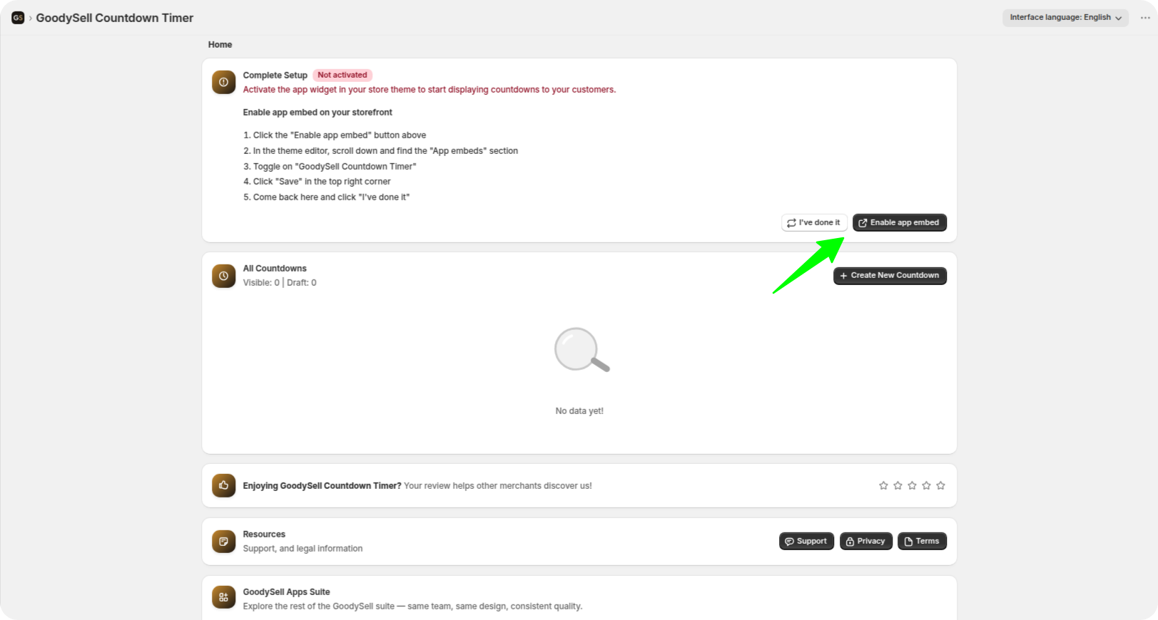
One switch has to be on before your timer can show up anywhere. Shopify calls it an app embed — think of it as permission for the app to display things on your live shop. If it's off, nothing appears, no matter what else you do.
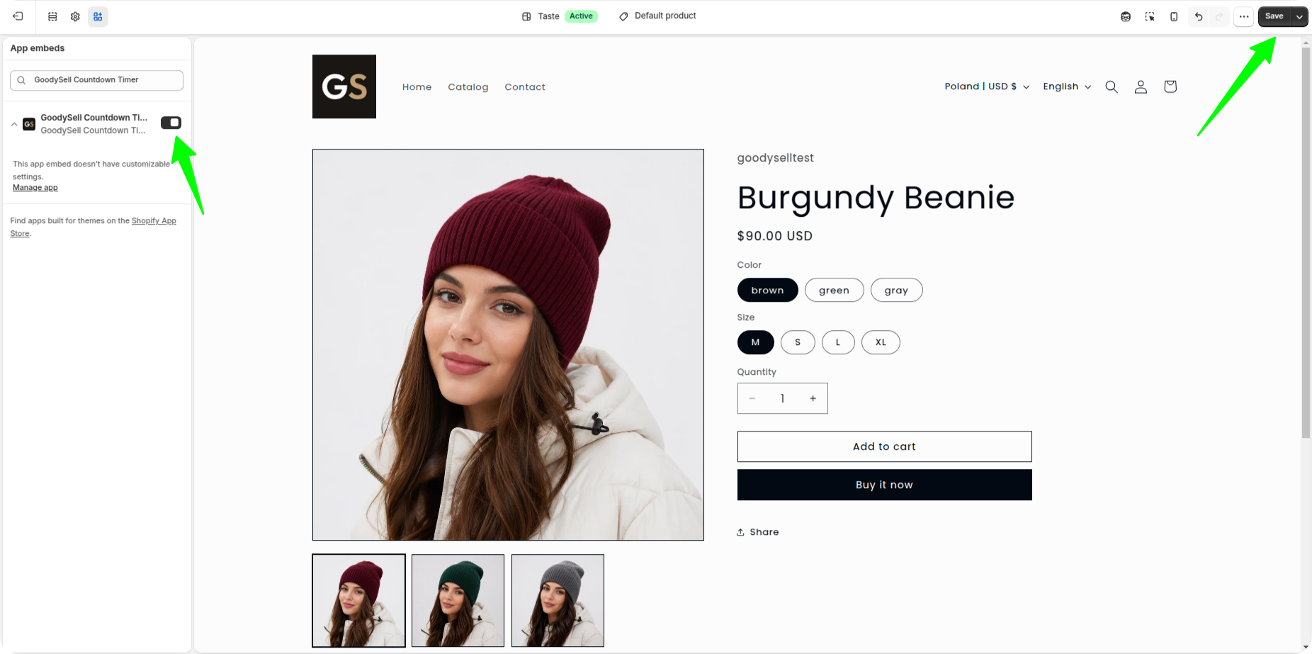
The app checks this for you. If it's off, you'll see a message under the preview: "App embed is off — this timer will not show", with a Turn on app embed button. Click it and Shopify opens the right settings page. Switch GoodySell Countdown Timer on, click Save, then go back to the app.
 Theme Editor:
Create the timer and choose Product Page
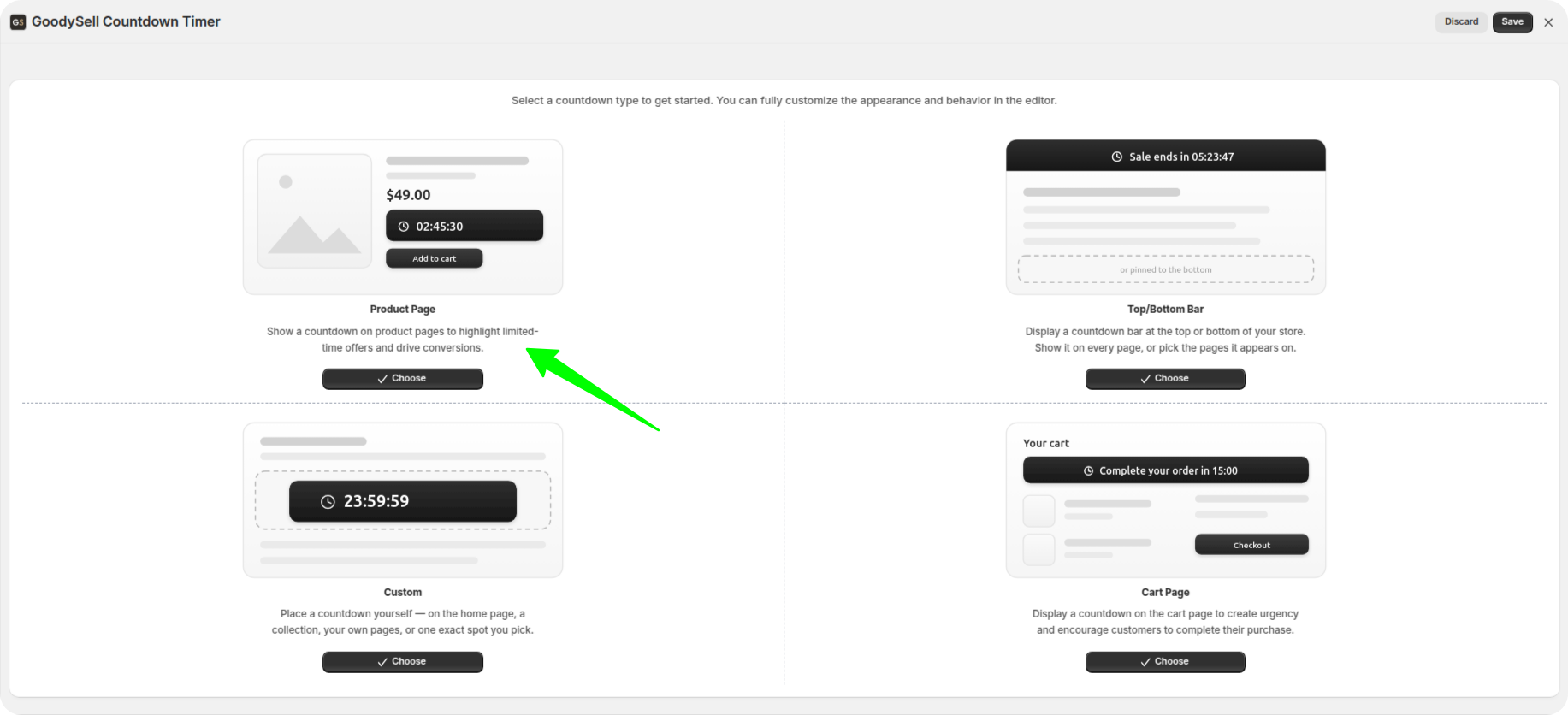
In the app, create a new countdown. You'll be asked where it should go, and you'll see four cards. Click Product Page.
This choice matters, because it decides what you'll see next and where the timer is allowed to sit.
Start with the preview
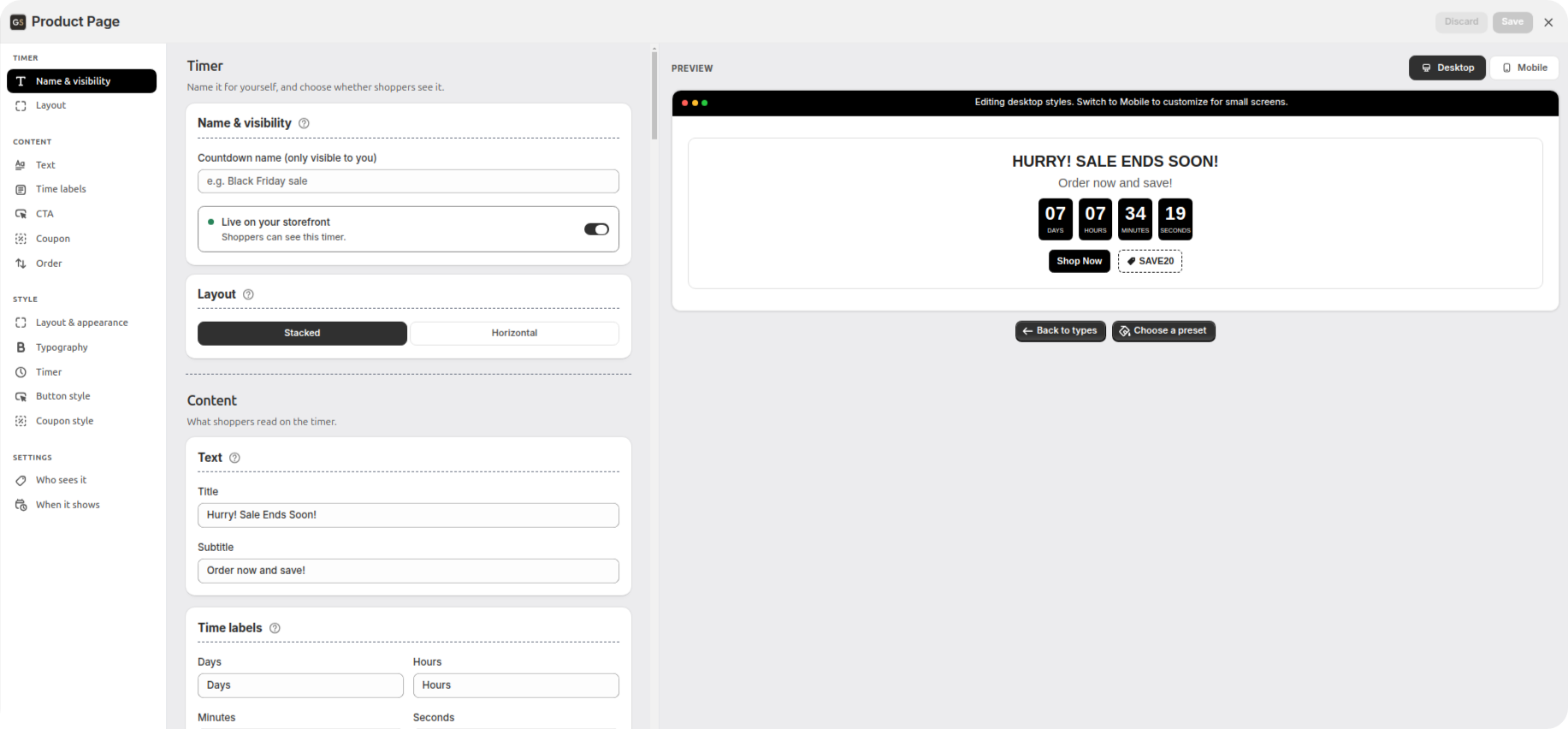
The editor has two halves: your settings on the left, and a Preview on the right.
The preview shows the timer exactly as shoppers will see it, inside a picture of a browser window so you can judge how it really looks. Change anything on the left and the preview updates right away — no saving and reloading.
Three buttons sit around it:
Desktop / Mobile, above the preview — switches between a computer screen and a phone screen.
Choose a preset, under the preview — the shortcut explained below.
View on storefront, next to it — opens a real product page in your shop. It shows up once you've saved the timer.
Once you've set the timer up and saved it, a small card appears along the bottom of the preview. It tells you whether the timer has been placed in your shop yet, and what to click if it hasn't.
Pick a preset first — it saves the most work
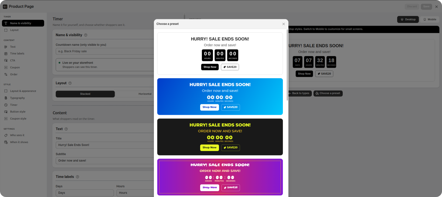
Click Choose a preset under the preview. Ready-made designs open, each shown as a full timer instead of just a colour, so you can see what you're picking. Click one and it's applied straight away.
Do this before anything else, because a preset only changes how the timer looks — it never touches your text. Pick one you like and you can skip the whole Style section later. What's left is what only you can decide: what the timer says (Content) and when and to whom it shows (Settings).
If none of the ones offered is quite right, pick the closest one and adjust it later — that's still faster than starting from nothing.
The settings on the left are split into four groups. We'll go through them in order.
1. Timer
The basics: what you call it and what shape it has.
Name & visibility
Give the timer a name. Only you see it, so name it after the campaign: "Spring sale — shoes" is much easier to find later than "Timer 3".
Under the name is a switch between Live on your storefront and draft. A draft is saved but shoppers can't see it. Leave it on draft while you're still setting things up — you'll come back and switch it on at the end.
Layout
Two shapes: stacked (title on top, numbers below, button underneath) or horizontal (everything in one row). Stacked fits a narrow product column; horizontal fits a wide page with more room.
Choose now, because you're about to write text that has to fit this shape.
2. Content
Everything shoppers actually read.
Text
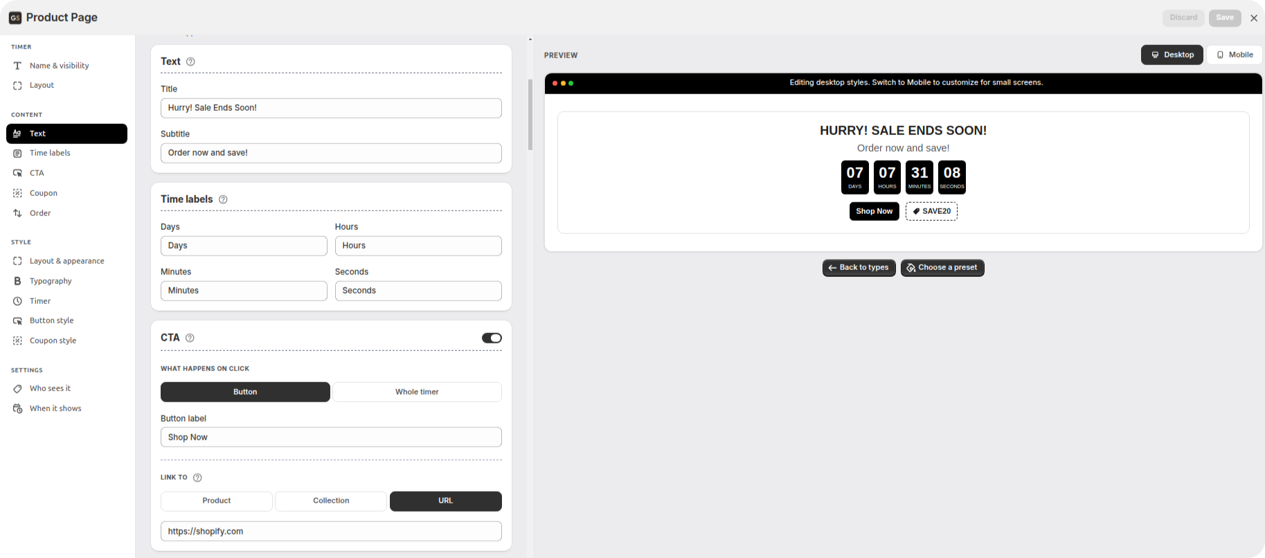
Fill in the Title and the Subtitle.
Say what's ending, not just that something is. "Free shipping ends in" tells the shopper something useful. "Hurry!" doesn't.
Time labels
The small words under the numbers — Days, Hours, Minutes, Seconds — are ordinary text boxes. Shorten them to "D / H / M / S" if space is tight, or write them in your own language.
CTA
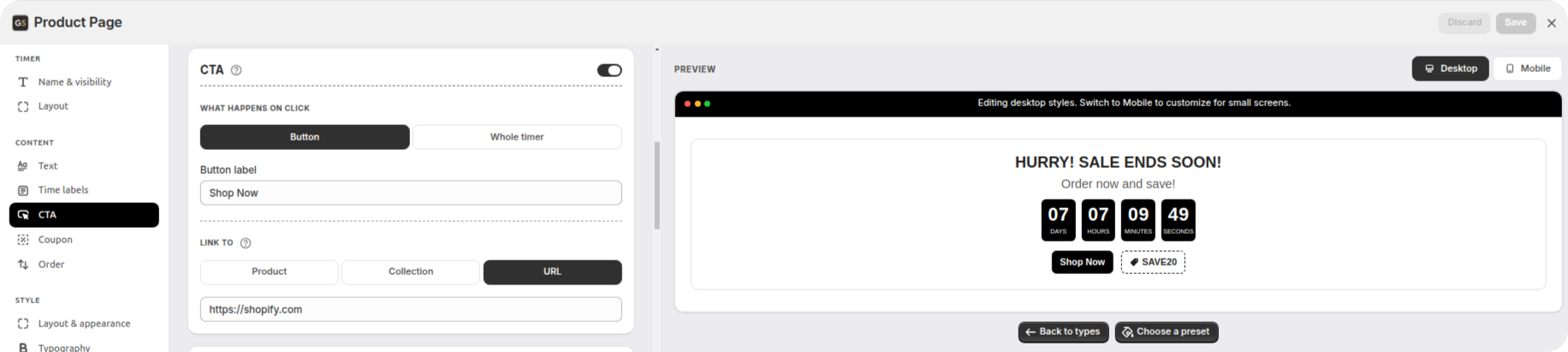
CTA just means "the thing you want the shopper to click". This card has a switch at the top, and that switch decides whether the timer links anywhere at all:
Switch off — the timer only shows the time, and nothing is clickable. On a product page that's often the right choice, because the shopper is already where they'd buy.
Switch on — two options appear: Button (a button under the numbers) or Whole timer (the whole timer becomes clickable, with no button shown).
With the switch on you also choose Link to — a Product, a Collection, or a URL (any web address) — and, if you picked Button, what the button says in Button label.
One honest tip: on a product page, a button sending people elsewhere competes with your Add to cart button. Unless it leads somewhere genuinely better, leaving the CTA switch off and showing a discount code instead usually works better.
Coupon
Same idea: a switch at the top of the card. Off, the card just tells you to turn it on. On, you get a Discount code box.
Shoppers tap the code and it copies itself, so nobody types it wrong. You can also show a small Tag icon and choose whether it sits before or after the code.
Create the code in Shopify under Discounts first, then paste it here — the app shows the code, it doesn't create it.
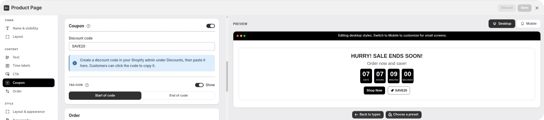
Order
One switch: Show coupon first. On, the code comes before the button; off, the button comes first. It only matters if you turned both the CTA and the coupon on.
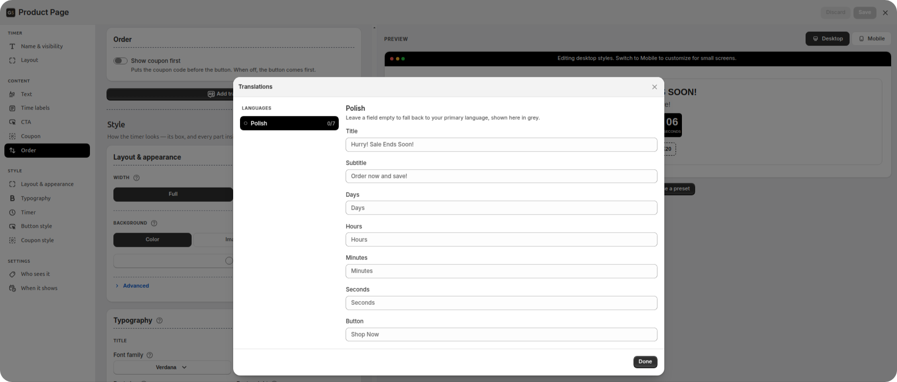
Add translations
At the bottom of Content there's Add translations. If your shop sells in several languages, you can translate the title, subtitle, the Days/Hours/Minutes/Seconds labels, the end message and the button text. Leave a box empty and it uses your main language instead.
The list of languages comes from your Shopify settings. It's worth doing: an English "HURRY! SALE ENDS SOON" on a German product page makes the whole shop look unfinished.
3. Style
How it looks — the box, and everything inside it.
If you picked a preset at the start, you can skip this whole section and come back only if something bothers you. Here's what you can change.
Five cards, in this order:
Layout & appearance — the timer as a box: Width, Background (colour, gradient, image or video), Border, Outline and Spacing.
Typography — the font, plus size, thickness and capitals for the Title and Subtitle.
Timer — the numbers themselves: Digits, Digit box (one box per unit, one box per digit, or no boxes) and Separator.
Button — appears if the CTA switch is on: the button's colours, border, corners and spacing.
Coupon — appears if the coupon switch is on: the same options for the code.
Don't skip mobile
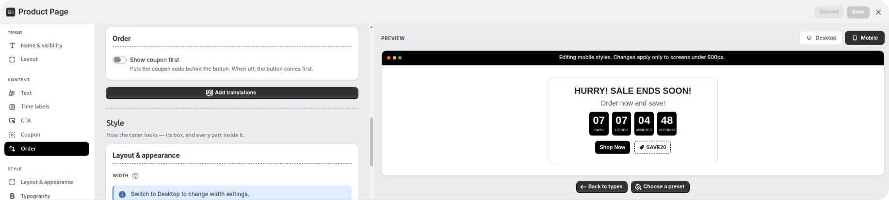
Above the preview is the Desktop / Mobile switch. This is the step most people skip, and it's the one that matters most — most of your shoppers are on a phone.
Mobile settings are saved separately and apply to screens narrower than 600 pixels (roughly, any phone), so you can make the numbers smaller on phones without changing anything on computers.
4. Settings
Where it runs, who sees it and when. Set once and rarely opened again.
Who sees it
Four ways to choose which products get the timer:
All products — it appears on every product page you have.
A specific collection — everything inside one collection. Add a product to that collection later and it gets the timer automatically.
One specific product — for a single launch or one item you're clearing out.
Products with certain tags — the most flexible one.
A quick word on tags: a tag is just a label you put on a product in Shopify (like clearance or blackfriday), and one product can have several. Point the timer at a tag, and adding that tag to a product puts it in the sale, while removing the tag takes it out — without opening the app again. That's why tags are usually worth the extra minute.
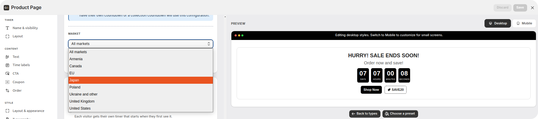
The same card has a Market setting. Markets are how Shopify groups the countries you sell to. Leave it on All markets unless the promotion really is for one region — pick one market and only shoppers there see the timer.
When it shows
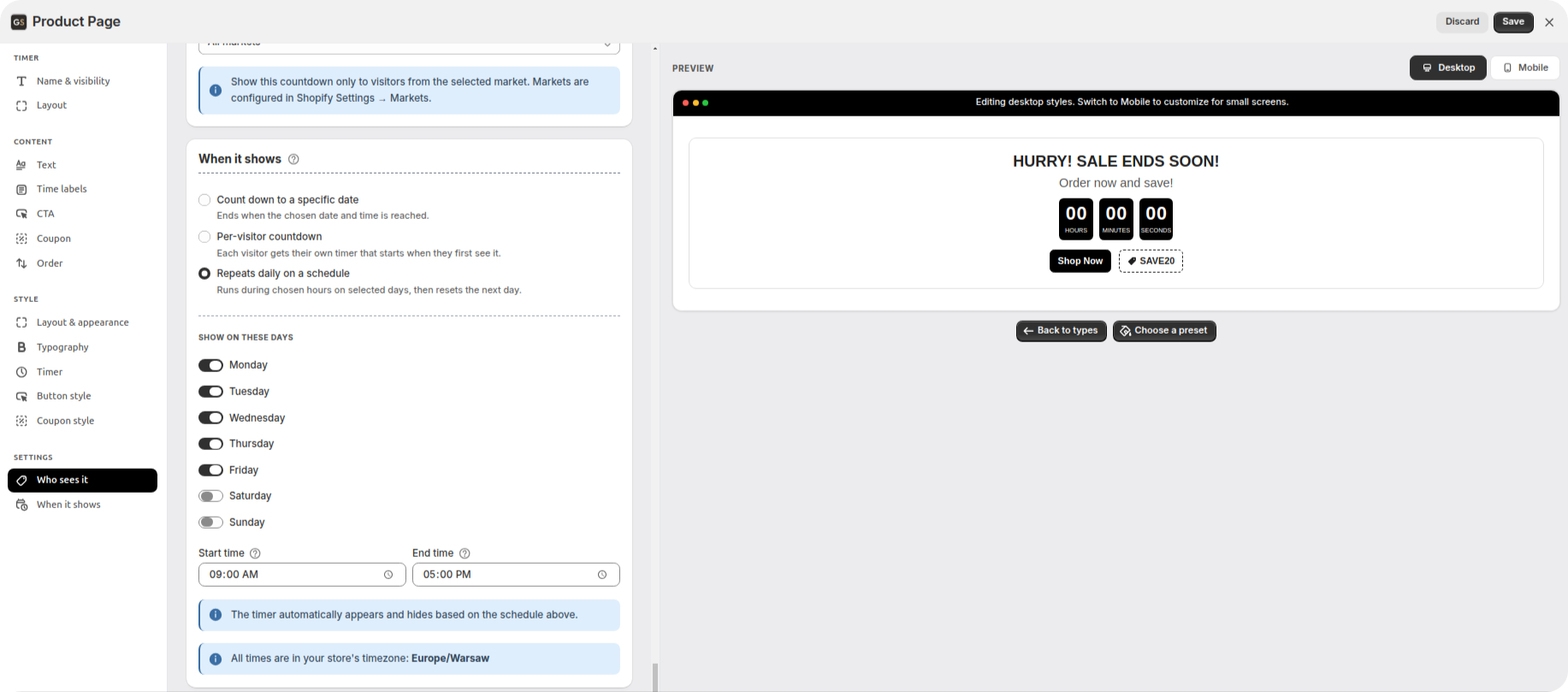
Three ways to run the countdown:
Count down to a specific date. Everyone sees the same clock, counting down to one date and time. Pick this when the deadline is real — a sale ending Sunday night, a shipping cut-off, a launch price that goes up on the 1st. All dates and times use your shop's time zone, which is written under the fields — worth a look if you're in a different one.
Per-visitor countdown. Each shopper gets their own clock, starting the moment they first see it; you set how many minutes it lasts. Their clock is remembered in their browser, so it won't start over if they close the tab and come back. Good for an offer that runs all the time, where each person still gets their own window.
Repeats daily on a schedule. Choose the days of the week and the hours. The timer runs during those hours and starts fresh the next day — your happy-hour deal, "20% off, weekdays 6 to 9pm".
Two extras in the same card:
Starts — with a date countdown you can also set a start date, and the timer stays hidden until then. Build your Black Friday timer in October and let it appear on its own.
When time runs out — the timer disappears, shows a message you write, or stops at 00:00:00. Per-visitor timers can also hide for that shopper or start again. Daily timers skip this choice: they just reset the next day.
Choose that last one on purpose. A timer sitting at zeros for a week looks worse than no timer at all.
Put it on the page
The timer exists now, but your shop doesn't know where to show it yet. You choose the spot yourself by dragging it — no code needed.
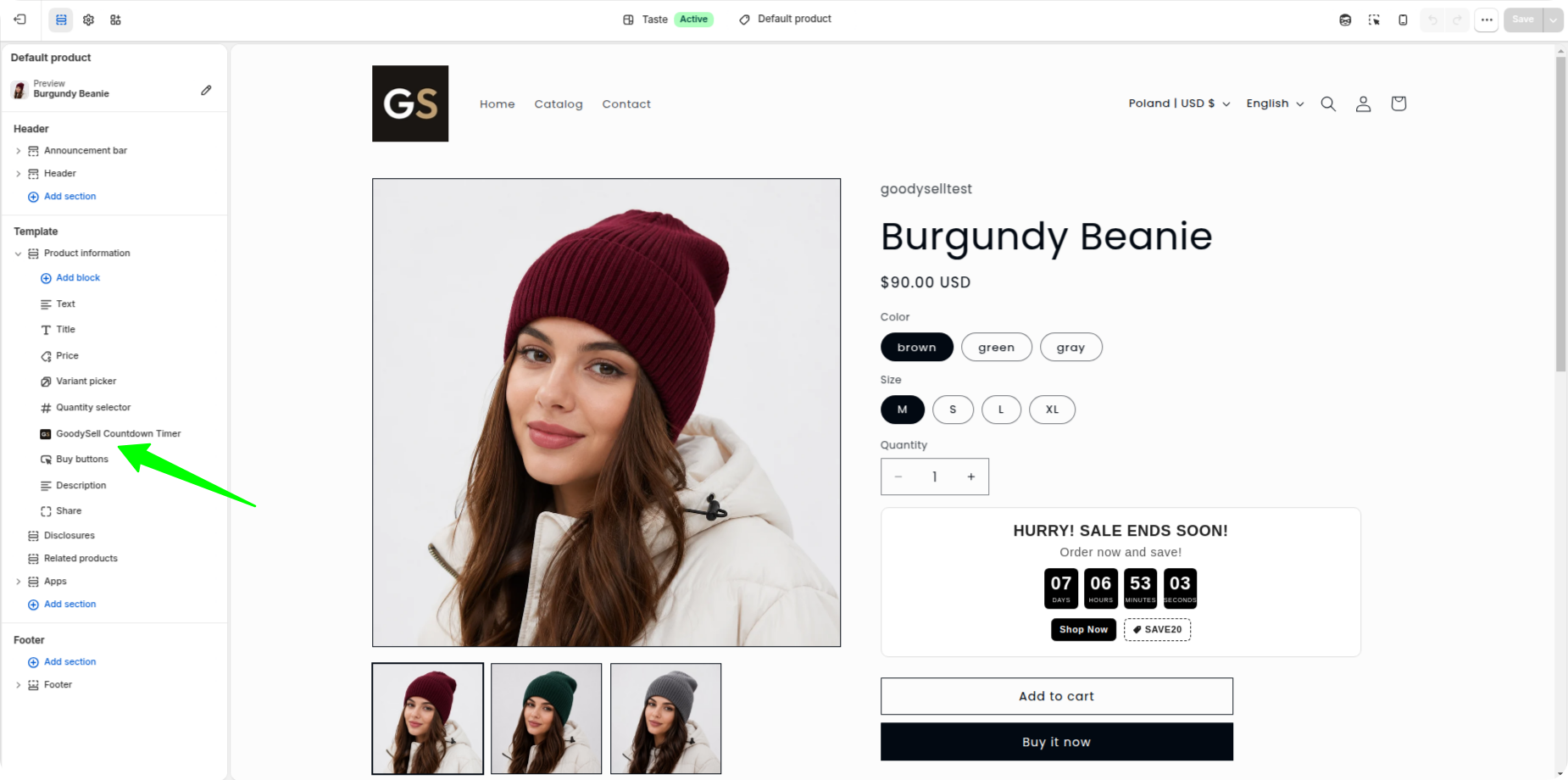
Save the timer, then click Add timer to theme. Shopify opens your theme editor on a product page. (The theme editor is Shopify's own page designer — you may know it from Online Store → Customize.)
Find the spot where you want the timer, click Add block, and choose GoodySell Countdown Timer.
Drag it where you want it and save.
(A "block" is just one piece of a page — your price is a block, your Add to cart button is a block. You're adding one more.)
Where should it go? Right above the Add to cart button works best, because the deadline and the decision are seen together. Just under the price is the next best spot. Avoid below the description — shoppers would have to scroll to find out there's a deadline at all.
If a spot says "No app blocks available", it simply doesn't accept extra blocks. Pick a different spot, or use the Custom timer type instead, which can go almost anywhere.
Go live and check your real shop
Back in the app, return to Name & visibility, switch the timer to Live on your storefront, and save.
Now click View on storefront under the preview to open a real product page, and check three things: the timer is where you put it, the numbers are counting down, and it looks right on your phone.
See whether it's working
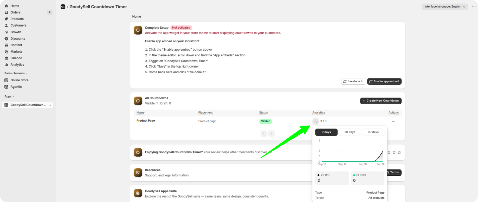
Every timer counts views (how many times shoppers saw it) and clicks (how many acted on it), shown as a chart for the last 7, 30 or 90 days.
Views tell you people really are seeing it where you put it. Clicks tell you the offer is tempting enough to act on — and clicks only mean something if the CTA switch is on, since a timer with nothing to click can't record any.
Lots of views and no clicks doesn't mean the timer is broken. Usually it means the deadline isn't convincing, or the offer isn't good enough. That's fixed in your wording or your discount, not in the app.
Common questions
Do I need to know how to code? No. Turning on the app embed is one switch, and placing the timer is drag-and-drop.
How do I make the timer show no link at all? Leave the CTA switch off. The card stays on screen so you can see what turning it on would offer, but the timer shows with no button and nothing clickable.
Can I have more than one timer on the same page? Yes, each with its own rules. But go easy — two deadlines on one page pull against each other instead of adding up.
What happens when the countdown reaches zero? Whatever you chose under When time runs out: it disappears, shows your message, stops at zeros, or (for per-visitor timers) hides for that shopper or starts again. Daily timers just reset the next day.
Will it make my pages slow? No. It loads one small design file and one small script per page. A font is only downloaded if you picked one the shopper's device doesn't already have — your own theme font and the standard system fonts need no download at all.
Can I show it only in one country? Yes — use the Market setting in the Who sees it card.
My timer isn't showing. What now? Check these in order: the app embed is on, the timer is live and not a draft, the block is actually on the page you're looking at, the product matches your rules, and the countdown hasn't already ended.
Give your shoppers a reason to decide today
A product page with no deadline lets the shopper decide whenever they like — which usually means never. Adding one takes about ten minutes: name it, write the text, style it, choose the products and the deadline, then drag it above your Add to cart button.
Install GoodySell Countdown Timer, try it on your best-selling product first, and watch the views and clicks for a week before rolling it out everywhere.