How to Add an Announcement Bar to Shopify
Your theme's announcement bar shows one message, everywhere, until you delete it by hand. Here's how to add one that knows which page it's on, when to appear and when to stop — in about ten minutes, without touching theme code.
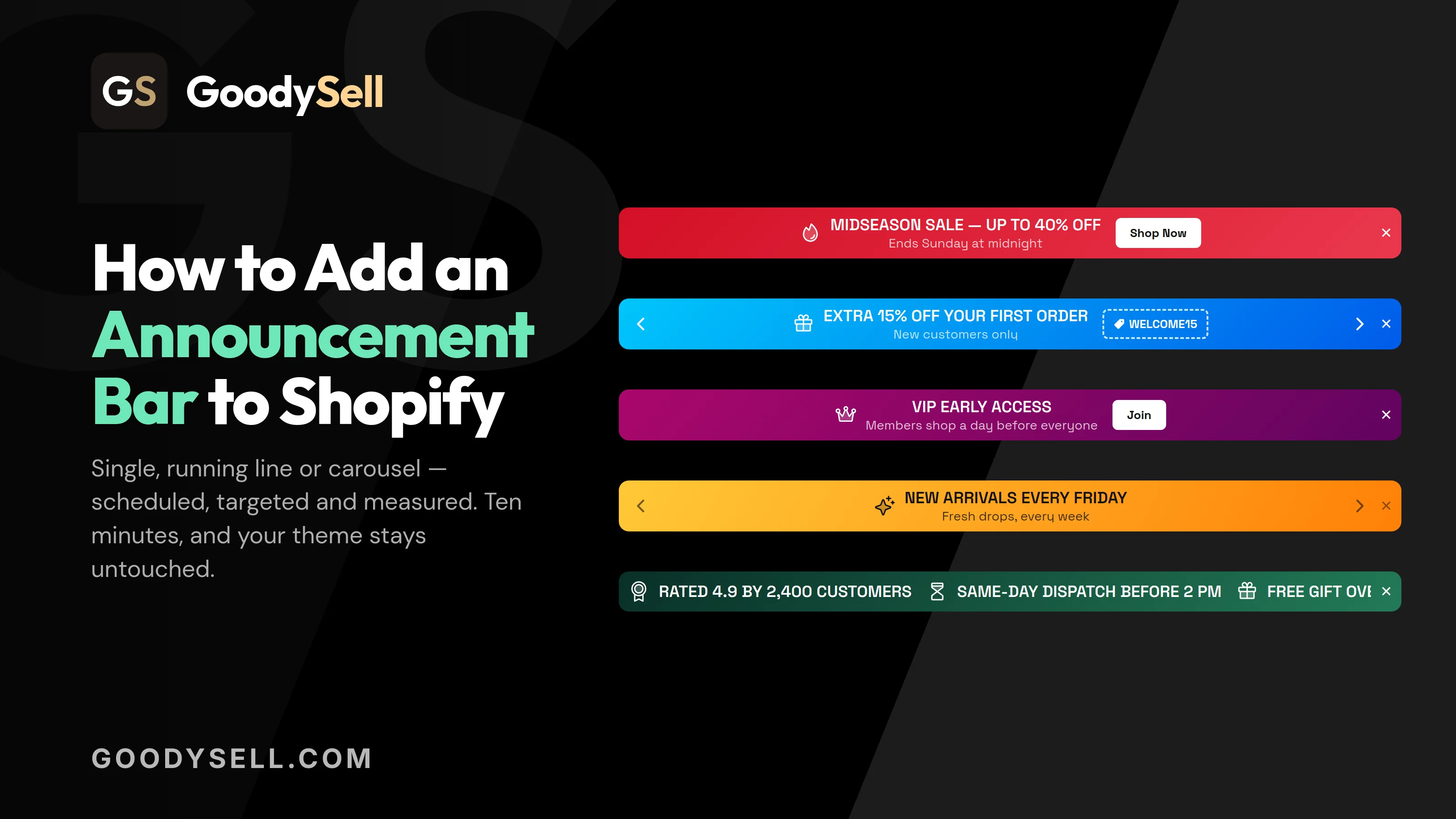
An announcement bar is the thin strip of text that sits across the top of a shop's website. It's where stores put the one thing they want every visitor to see: free shipping, a sale deadline, a discount code.
This guide shows you how to add an announcement bar to Shopify in about ten minutes. You don't need to write a single line of code, and you don't need anyone technical to help you.
The problem: your best news is on the page nobody opens
Every store has a few facts that decide whether someone buys today. Free shipping starts at $50. The sale ends Sunday. Order before Thursday and it arrives before the holidays. Delivery to Germany takes five days right now.
In most stores, those facts sit on a shipping policy page, an FAQ, or somewhere down in the footer. Those are pages a shopper opens after they've already made up their mind, if they open them at all.
The obvious fix is the announcement bar that comes built into your theme. (Your theme is the design of your store, the template that decides how your pages look.) It works, until you ask it to do anything useful:
It's one bar for the whole store. The same sentence appears on your home page, on your clearance collection and on a product that's sold out. You can't say "free shipping over $50" on one page and "this item ships in March" on another.
You can't schedule it. If a sale ends Sunday night, someone has to sit down on Sunday night and delete the text by hand. Forget, and Monday's shoppers read about a sale that's already over.
It shows one message at a time. Free shipping, your discount code and your returns promise are three things worth saying. You get to pick one.
Changing how it looks means editing code. The height, the spacing, a nicer background, a smaller font on phones: all of that lives in your theme's code, and every change is an edit you have to remember you made.
You have no idea whether it works. No numbers on how many people saw it, none on how many clicked. Nothing to tell you whether it earned its place on the screen.
What an announcement bar app actually changes
GoodySell Announcement Bar takes that same strip of screen and turns it into a proper marketing tool. It hands you four decisions that the theme's built-in bar makes for you:
What shape it takes. A single bar with one message, a running line where several messages scroll past continuously, or a carousel where messages take turns, one replacing the next on a timer.
Where it sits. At the top of the page, at the bottom, on the cart page, inside the cart drawer (the panel that slides out when a shopper adds something to their basket), or in a spot you choose yourself.
Who sees it. Everyone, or only people looking at one product, or a whole product category, or any product you've labelled a certain way, or only shoppers in one country.
When it runs. Always, from a date onwards, between two dates, for a few minutes per visitor, or on a weekly repeating schedule.
On top of that you get: a discount code shoppers can tap to copy, a button or a bar that's clickable all over, a set of ready-made colour palettes, separate settings for phones, translations for stores that sell in more than one language, and a simple chart showing how many people saw and clicked each bar.
Here's the part that matters most for this guide. For a bar at the top or bottom of the page, you never touch your theme's code. You flip one switch to turn the app on, and everything after that happens inside the app.
Let's set one up.
Step 1: Turn on the app embed (the only theme step)
Before your bar can appear anywhere, Shopify has to give the app permission to show things on your store. That permission is called an app embed. It's one switch, and you only flip it once.
In plain terms: Shopify keeps apps separate from your shop's design by default. The app embed is you saying "yes, this app is allowed to display on my pages."
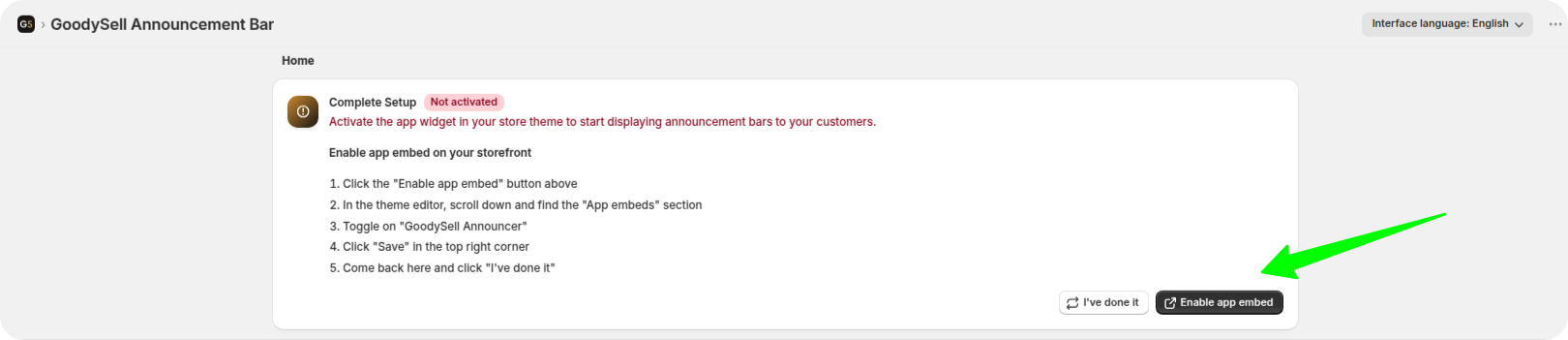
Open the app. If the permission isn't on yet, the home page shows a Complete Setup card with a Not activated label and an Enable app embed button.
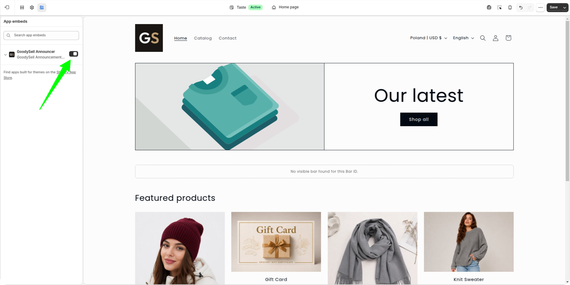
Click Enable app embed. Shopify opens your theme editor (the screen where you customise your store's design) with the right settings already selected for you.
Scroll to the section called App embeds.
Switch on GoodySell Announcer.
Click Save in the top right corner.
Go back to the app and click I've done it.
The card changes to Widget Activated. That's the last time you'll open the theme editor in this guide.
Step 2: Create your first bar
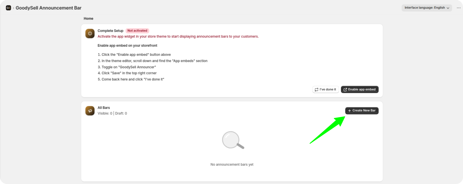
The app's home page has a section called All Bars. It's a list of every bar you've made, with columns for the Name, the Type, who it's shown to (Target), whether it's on or off (Status), its Analytics, and buttons to edit, hide, copy or delete it. Right now it's empty.
Click Create New Bar. The editor opens.
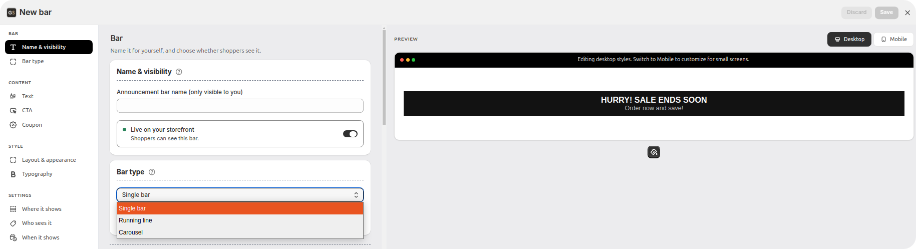
Choose the bar type — this one can't be changed later
The first thing the editor asks is Bar type, and there are three:
Single bar. One message. The classic announcement bar, and the right choice most of the time.
Running line. Several messages scrolling continuously across the bar, left or right, at a speed you set. It can pause when someone hovers their mouse over it. (There's a full guide to scrolling text if that's what you're here for.)
Carousel. Several messages that replace each other on a timer, with optional arrows so shoppers can click through them.
Choose carefully, because you can't change the bar type after you save it. The reason is simple: a single bar stores one message, while the other two store a list of messages. Switching between them would leave your text with nowhere to go. If you change your mind later, you create a new bar instead. It takes a minute.
For your first one, choose Single bar. Everything below is written for it, and most of it carries straight over to the other two: the steps come in the same order, and the targeting and scheduling settings are identical. What differs is the Content block, where instead of one title and subtitle you build a list of messages, and a couple of extra settings that come with them:
A running line and a carousel both add a Motion section under Style — scrolling speed and direction for the running line, and how many seconds each message stays on screen for the carousel.
A carousel adds a Navigation section too, for the arrows shoppers click to move between messages.
On a carousel, the link and the discount code are set on each message separately, inside that message's own card, rather than once for the whole bar. So the CTA section in Step 5 below applies to a single bar and a running line; on a carousel you'll find the same settings, just repeated per message.
Step 3: Find your way around the editor
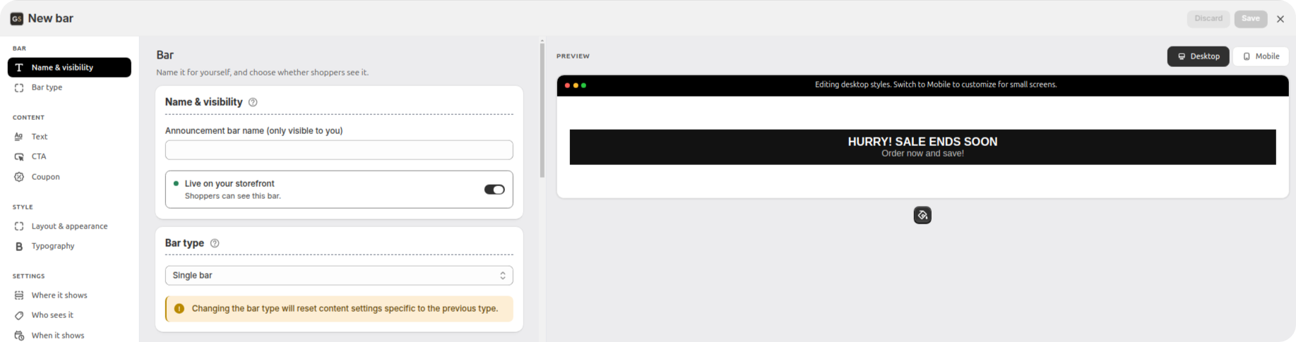
The editor is split into three columns:
On the left, a list of the same settings sections that are on the right, so you can jump straight to the one you want instead of scrolling.
In the middle, the Preview: your bar drawn exactly as shoppers will see it, updating as you type. Above it is a Desktop / Mobile switch. Below it there's a colour palette button, a View on storefront link, and a note telling you whether the bar is actually placed on your store yet.
On the right, the settings themselves. They're grouped into four blocks, and the same four blocks are what you see in the list on the left. Work through them in order:
Block | What it covers |
|---|---|
Bar | Name it for yourself, and choose whether shoppers see it. |
Content | What shoppers read on the bar. |
Style | How it looks, from the whole bar down to each element on it. |
Settings | Where it runs, who sees it and when. |
Nothing needs saving and reloading to check. Every change shows up in the preview straight away.
Pick a colour palette first — it saves the most work
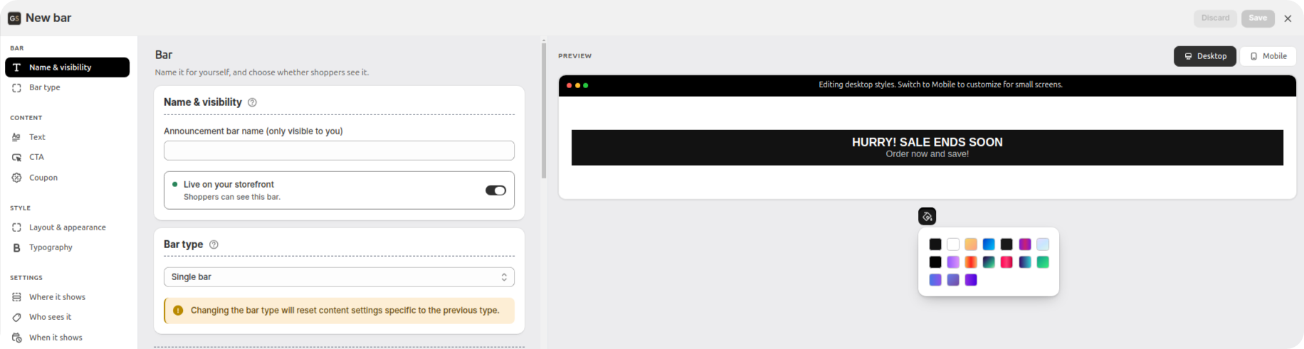
Click the colour button under the preview (Choose color theme). A set of ready-made palettes opens: Dawn, Ocean, Sunset Blaze, Cyber, Midnight, Berry and others. Click one and it's applied instantly.
Do this before anything else. A palette changes only how the bar looks, never what it says. Pick one now and the whole Style block becomes optional. What's left is the part only you can decide: what the bar says, and who it says it to.
Step 4: Bar — name it, and keep it hidden for now
In Name & visibility, give the bar a name. Nobody but you sees this, so name it after the campaign. "Free shipping over $50" is a lot more useful than "Bar 2" once you have eight of them.
Underneath is the switch between Live on your storefront and draft. A draft is a bar that exists in the app but isn't shown to shoppers yet. Leave it on draft while you build, exactly as the app says: "Only you can see this bar until you turn it on." You'll switch it on at the end.
Step 5: Content — write what shoppers read
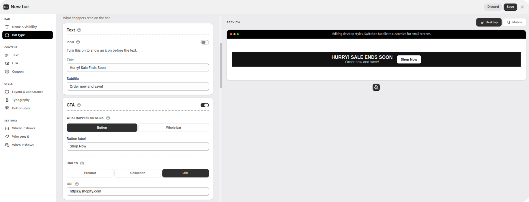
Text
Fill in the Title and, if you want a second line, the Subtitle.
Be specific. "FREE SHIPPING ON ORDERS OVER $50" does a job. "GREAT NEWS!" does not. People read an announcement bar in about a second, usually out of the corner of their eye. It has to carry the actual fact, not a hint that a fact exists.
CTA (the clickable part)
CTA stands for "call to action". In this app it simply means: does the bar lead anywhere when someone clicks it?
That's controlled by a switch in the card's header:
Off. The bar is information only. Nothing is clickable.
On. Two options appear. Button puts a small labelled button on the bar. Whole bar turns the entire strip into a link, with no button drawn on it.
With the switch on, you also choose Link to: one of your Products, one of your Collections (a collection is a group of products, like "Summer sale" or "Shoes"), or any URL you paste in, including pages outside your store. If you chose the button option, you also write the Button label.
For a free-shipping bar, Whole bar linked to your bestsellers usually works better than a button. The bar is already small, and a button inside it is a small target inside a small target, especially on a phone.
Coupon
Same pattern: a switch in the card's header. Turn it on and a Discount code field appears.
The code shows on the bar as a small badge, and shoppers tap it to copy it, so nobody has to retype it at checkout and nobody gets it wrong. You can add a small tag icon next to it and choose whether that icon sits before or after the code.
One thing to get right: create the discount first in your Shopify admin, under Discounts, then paste the code here. The app displays a code, it doesn't create one. A bar advertising a code that doesn't work is worse than no bar at all.
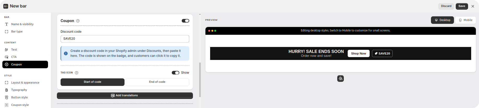
Add translations
If your store sells in more than one language, click Add translations at the bottom of the Content block and translate the title, subtitle and button label.
Leave a field empty and that language falls back to your main one. The app shows you the fallback text in grey, so you can see exactly what a French visitor will read.
The list of languages comes from your own store settings (Shopify Admin → Settings → Languages). It's worth the two minutes. An English "SALE ENDS SUNDAY" sitting on top of a French storefront makes the whole shop look unfinished.
Step 6: Style — only if the palette wasn't enough
If you picked a colour palette back in step 3, skip this block entirely and come back when something bothers you. When you do, here's what's inside:
Layout & appearance. The bar as a whole: its background (either a plain colour or an image), how the text is aligned, how much space sits around it, and borders tucked away under Advanced.
Typography. The font, its size, how bold it is, and whether the text is upper or lower case, set separately for the title and subtitle. There's also an option to Use your theme fonts, which matches the bar to the rest of your store automatically.
Icon style. A small picture before the text, chosen from a large library (including country flags), or your own image file.
Button style and Coupon style. Each of these appears only once you've switched that element on.
Close button. Its colour and size, if you're letting shoppers dismiss the bar.
Motion, and on a carousel Navigation. These two only appear for running lines and carousels, and they're described back in step 2.
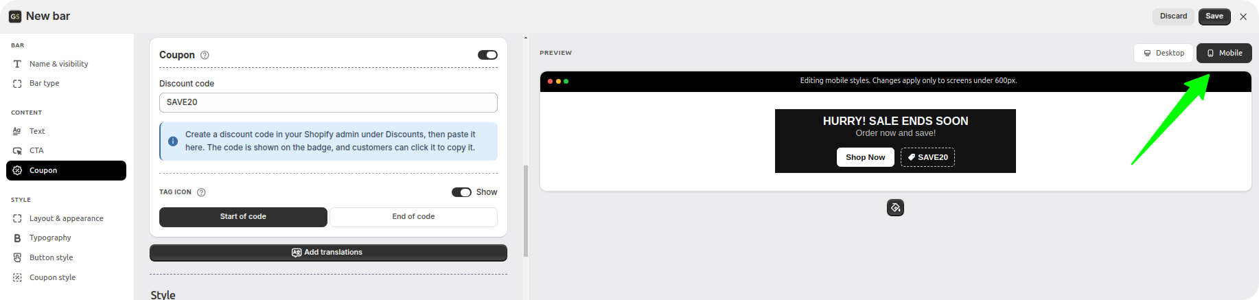
Don't skip mobile
Above the preview is the Desktop / Mobile switch. This is the step most people skip, and it's the one that matters most. Most of your visitors are on a phone, and a bar that sits comfortably on a wide laptop screen can wrap onto three lines on a narrow phone screen.
Phone settings are saved separately from desktop ones, and they apply to any screen narrower than 600 pixels (roughly, any phone). So you can shrink the font for phones without touching how it looks on a computer. The app tells you which of the two you're currently editing, right under the preview.
Step 7: Settings — where, who and when
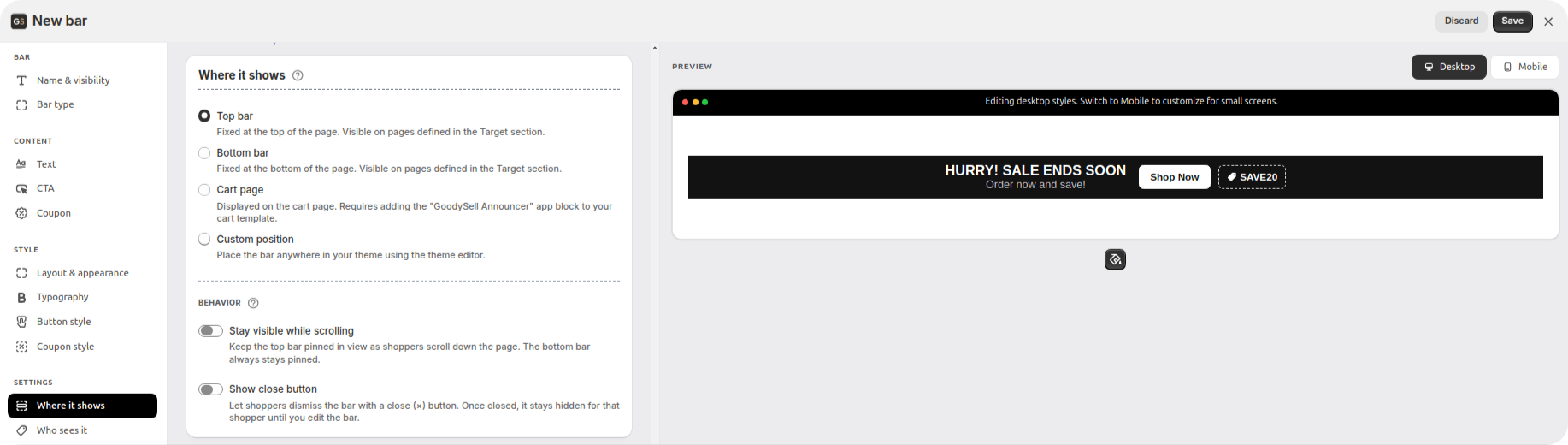
Where it shows
There are four places to put it:
Top bar. Fixed at the top of the page. The default, and where shoppers expect to find it.
Bottom bar. Fixed at the bottom. Handy when your header already has a lot going on.
Cart page. Shown while someone is reviewing their basket. You choose between the cart page itself and your theme's cart drawer (the panel that slides in from the side when someone adds an item), and, for the drawer, whether the bar goes at its top or its bottom. There's also Hide when cart is empty. One caveat: the drawer option works on themes in the Dawn and Horizon families, because a cart drawer isn't a standard part of every theme. If yours isn't supported yet, the app shows a Request theme support button — and the cart page option still works on any theme that accepts app blocks there. There's a separate guide to cart drawer messages if that's the placement you want.
Custom position. Anywhere else in your store. In the theme editor you add a block called GoodySell Bar by ID, then copy the Bar ID from the app and paste it into that block's field. For older themes that don't accept app blocks, the app also gives you a short snippet you can paste into a Custom Liquid block instead.
Top and bottom bars need no work in your theme at all. The permission you switched on in step 1 is what puts them there. That's the no-code path, and it's why this guide starts with it. Cart and custom-position bars need one extra element dragged into place in the theme editor. That's drag-and-drop, not typing code, and the app walks you through it step by step when you pick those options.
If you chose a top or bottom bar, a Behavior block appears with two switches:
Stay visible while scrolling. The bar follows the shopper down the page instead of disappearing off the top. This one is offered for the top bar only — a bar already fixed to the bottom of the screen has nowhere to scroll away to.
Show close button. Lets shoppers dismiss the bar if they don't want it.
Who sees it
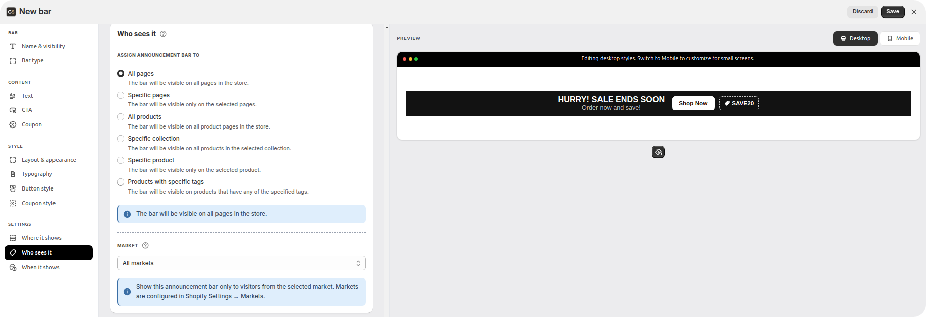
This is where the app leaves the theme's built-in bar far behind. You can show a bar to:
All pages. Everyone, everywhere in the store.
Specific pages. Choose page types — Home, Product pages, Collection pages, Blog pages, Blog posts, Cart, Search and 404 — or list exact addresses.
All products. Every product page in the store, but nothing else. Your home page, blog and cart stay clear.
Specific collection. Everyone looking at any product in that group. Add a new product to the collection later and it picks up the bar automatically.
Specific product. One product only.
Products with specific tags. A tag is just a label you stick on a product inside Shopify, like
clearance,bfcmorpreorder. Type the tags here and the bar appears on every product carrying any of them. Capital letters don't matter.
The same card has Page visibility, which lets you flip the logic around. Include means the bar shows only on the pages you picked. Exclude means it shows everywhere except them. You can match pages by their type, by their exact address, or by URL keywords, which means any page address containing a word you choose, such as every address containing "winter". (Running a different bar on each part of the store is a guide of its own.)
Tags deserve a moment, because they're the most useful option here. Point a bar at a tag, and from then on you control the campaign from your product list: add the tag to a product and it joins the campaign, remove the tag and it leaves. You never have to open the app again.
Last on this card is Market. A market in Shopify is a country or group of countries you sell to. Leave it on All markets unless the promotion really is regional. Pick one, and only shoppers in that market see the bar. You set markets up in Shopify Settings → Markets.
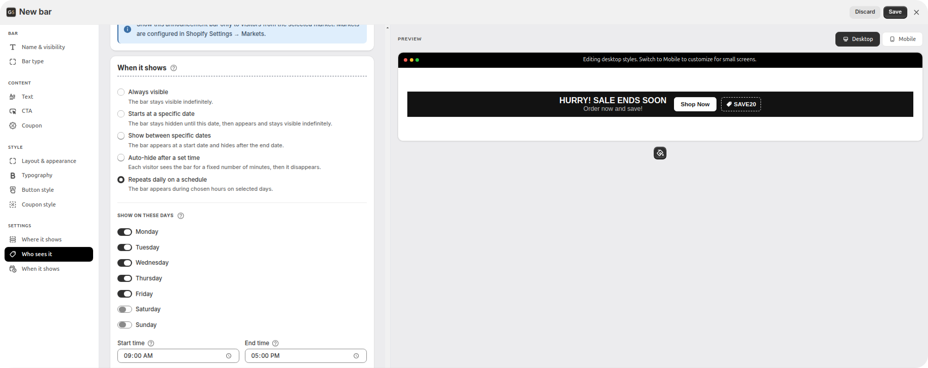
When it shows
Five schedules to choose from:
Always visible. It stays up until you turn it off yourself.
Starts at a specific date. Hidden until that date, then visible from then on. Build your Black Friday bar in October and let it appear on its own.
Show between specific dates. Appears on the start date, disappears after the end date. This is the one for any sale with a real deadline.
Auto-hide after a set time. Each visitor sees the bar for a number of minutes you choose, then it goes away for them.
Repeats daily on a schedule. Pick the days of the week and the hours. A happy-hour deal running weekdays 6–9pm looks after itself.
All dates and times use your store's timezone, which the app prints under the fields. Worth a glance if you happen to be working from a different country than your store is set to.
Step 8: Go live and check your real store
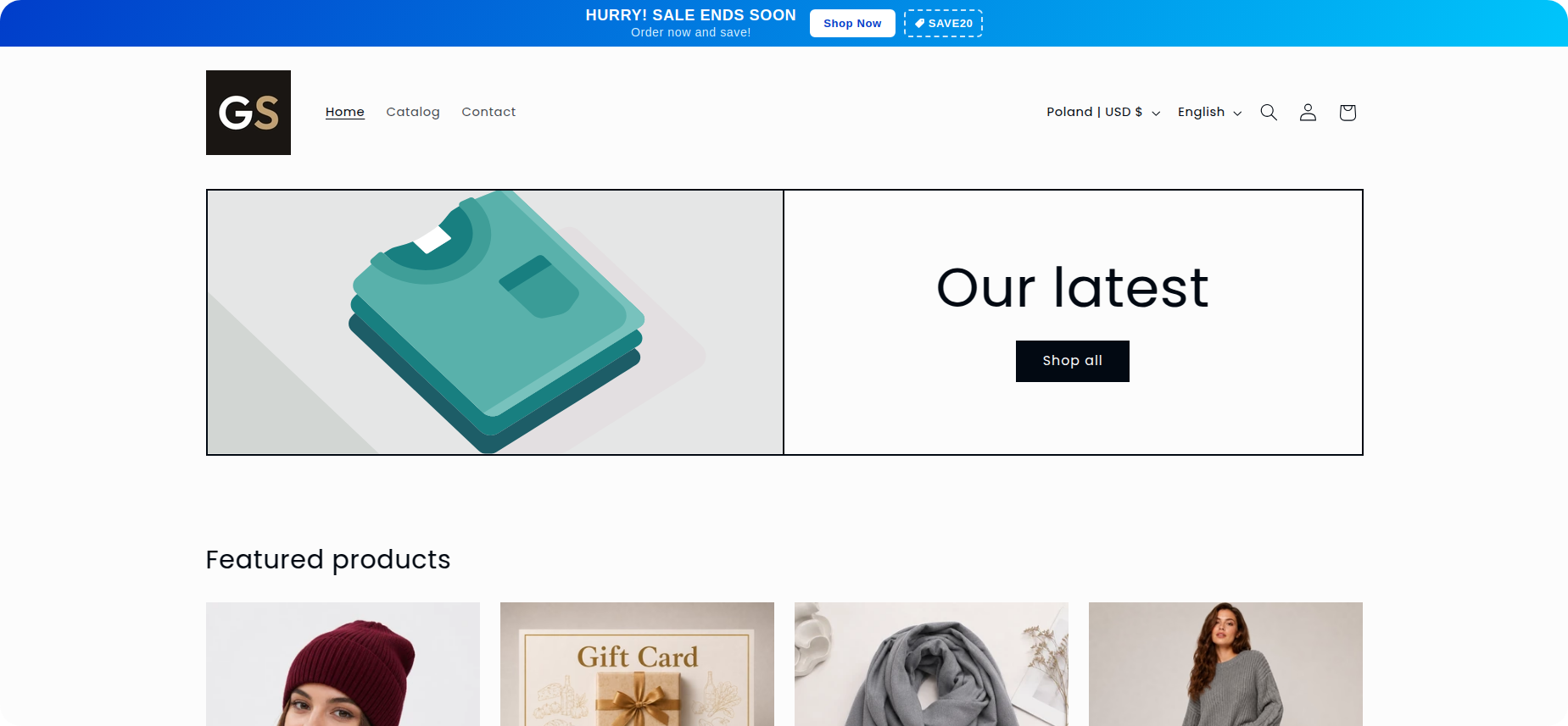
Scroll back up to Name & visibility and switch the bar from draft to Live on your storefront. Save.
Now click View on storefront under the preview and check three things on the real page:
The bar is where you put it, and your header still looks right underneath it.
The text isn't wrapping onto awkward extra lines.
It looks right on your actual phone, not just in the app's mobile preview.
Step 9: See whether it's working
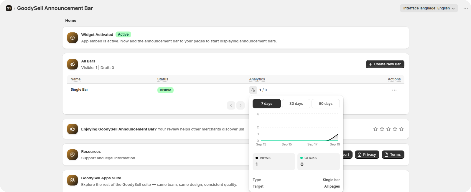
Every bar keeps track of two numbers: views, meaning how many times shoppers saw it, and clicks, meaning how many acted on it. You'll find them as a chart covering the last 7, 30 or 90 days, in the Analytics column on the All Bars page.
Views tell you the bar really is appearing where you think it is. Clicks only mean anything if you switched the CTA on, since a bar with nothing to click can't record one.
And lots of views with very few clicks doesn't mean the app is broken. Usually it means the message isn't interesting enough, or the offer isn't good enough. That's something to fix in your wording or your discount, not in the settings.
Running more than one bar
Once the first one is live, the rest is just repetition. Create a second bar, point it at a different audience, and both run side by side. A shipping message for the whole store, say, plus a clearance banner that only appears on tagged products.
When two bars land in the same spot, they stack in the order you created them.
Go easy, though. Two bars stacked above your header push your product photo down out of sight, and three messages fighting for the same second of attention all lose.
Common questions
Do I need to know how to code? No. A top or bottom bar needs one switch in the theme editor, the app embed from step 1, and everything else happens inside the app. Cart and custom-position bars need one element dragged into place, which is drag-and-drop.
Will it survive a theme update? Yes. Nothing is written into your theme's files, so updating your theme or switching to a new one won't wipe out your bars. You'll just need to turn the app embed on again for the new theme.
Can I show a different bar on different pages? Yes, that's exactly what Who sees it and Page visibility are for. Target by product, collection, tag, page type or a word in the page address, and run as many bars as you need.
Will it slow my store down? No. The app loads two small files and nothing else. Fonts only get downloaded if you choose one the visitor's device doesn't already have. Your theme's own fonts and standard system fonts need no download at all.
My bar isn't showing. What now? Check these in order: the app embed is switched on, the bar is set to Live and not left as a draft, the targeting rules actually match the page you're looking at, the schedule is active right now, and, for cart or custom-position bars, the app block is really in place in your theme.
Can I set up a bar for a sale that hasn't started yet? Yes. Use Starts at a specific date or Show between specific dates, and the bar will appear and disappear on its own, in your store's timezone.
Ten minutes, and your store starts talking
The facts that sell your products, free shipping, the deadline, the code, the cut-off date, are worth nothing on a page shoppers never open. Putting one of them at the top of every page takes about ten minutes: switch the app on, write one sentence, pick a colour palette, choose who sees it and when.
Install GoodySell Announcement Bar, start with your single most useful fact, and watch the views and clicks for a week before you add a second bar.